Photographer, musician, sculptor, writer, architect… if you create anything, you will have your champions and you will have your detractors – the people who applaud when you succeed, and the people who applaud when you fail. Whatever it is you conceive and produce, someone will always cast negativity all over it. I’m not talking about constructive criticism here, or even indifference – I’m referring to the people who, no matter how technically and aesthetically perfect you think your concept and execution are, will pick your work to pieces. For me, the very worst type of critic is the one who tells you how you should have done it, or how they’d have done it…
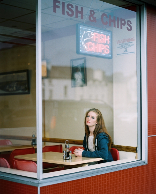
‘Truly interesting choice of both a peculiar environment and photographic perspective, it really works well. It reminds me of Hopper’s painting. What unfortunately ruins this smart idea is the subject choice which is just obvious, unoriginal and meaningless. Maybe an old man reading a newspaper or some intriguing subject/scene would have created a more effective and interesting composition.’
‘Hey Phil, this pic is very nice – it looks good. But there are two things in this picture. The fish & chips sign are distracting a lot. It wouldn’t be a problem if the reflection of the window would show a very beautiful place. Right now you see a car and a building, so this is dead space for me. Under this circumstances I would love to be closer to her and see her feelings in her face.’
I wanted a woman in the shot – if I’d wanted a man reading a newspaper, I would have done so. The image is composed like that because that’s exactly the way I wanted it – the FISH & CHIPS sign, the reflections, the ‘dead space’ are all there because, funnily enough, that’s exactly the way I wanted it.
Fish & Chips, since being posted on Facebook two days ago, has received over 4000 ‘likes’ (over 4 photographically related groups) and is still climbing…

Pentax 67, 105mm 2.4, Kodak Portra 400
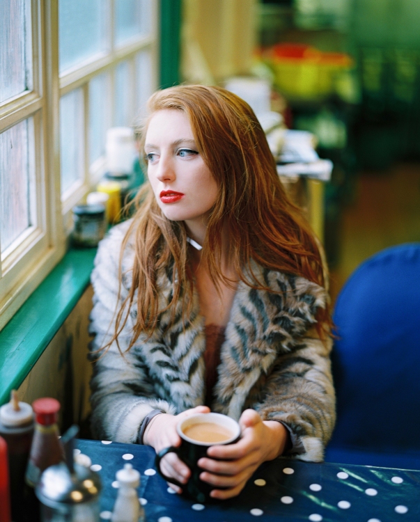
Pentax 67, 105mm 2.4, Kodak Portra 800
Developed and scanned at the superb UK FILM LAB

I’d joined a local photographer’s club a year or two ago, and then against my better judgement, entered a few of my pics into their contest, to be judged. I quickly learned it wasn’t for me. My pictures are just that, my pictures. Taken for my enjoyment. If others like them, fine, if not, whatever. But, having my pics critiqued took away the joy I get while taking them. That said, I love your fish and chips picture… just the way you took it… the beautiful girl’s rather melancholy expression, the building reflected so I can wonder about the neighborhood, the colors and the way they balance over the entire picture…her deep teal jacket, a few shades darker than the window frame, the rusty red of the lit-up sign balancing with the chairs and store front. Nicely done!
LikeLiked by 3 people
It is both real and beautiful. The reflections are reflective in itself allowing us to mentally drift to another imagery. The sign is perfect for this image giving it another frame….bit like how make-up artists create eyebrows haha. Colours are strong enough yet easy on the eye and compliment your model perfectly. Good job and keep up the good work. In a nutshell I would have to say that your images are like a gift that keeps on giving and I appreciate them immensely.
LikeLiked by 1 person
As always, beautiful portraits!
LikeLiked by 1 person
You tell ’em, Phil! Stunning work as always.
LikeLiked by 1 person
Excellent as ever – plough your own furrow.
LikeLiked by 1 person
Well I think it looks great!
LikeLiked by 1 person
The dead space, is where the narrative lays in this frame, without it, it would lose so much, you’ve made the decisions, compositional, that make a slight sentence, into a narrative rich novella and a wonderful one.
The (wasted) time, the worse kind of critics take, to hypothesise, unsolicited, on how they might of improved someone else’s work, fucking hell, my advice, just use that time to go make the frame you want. All these net brave geniuses, wise folk wait for their opinion to be asked for. End of story.
LikeLiked by 2 people
FISH & CHIPS is one of my favourites of your photos Phil. There is a raw story presented for us to wonder at while admiring the beautiful wrappings that it comes in.
As for your critic’s “dead space” I guess I don’t understand that concept as I don’t see any at all.
LikeLiked by 1 person
I L-O-V-E this! By far one of the best images I’ve seen in 2016. You’re style is very contemporary, yet extremely well thought and works online. But you should really consider putting up an exhibition with large prints. I’d fly from Brazil to whenever that is just to appreciate your photos. Please, use every monetary tool possible (Patreon, Kickstarter…) to achieve this for your fans. A fine book would be nice too. You’re awesome. Cheers!
LikeLiked by 1 person
The band of reflection above the girls head and below the fish and chips sign adds a lot of context. A tighter shot would lose that and just be photo of a girl. With this composition, we have an interesting looking person and her environment. Fuck those critics.
LikeLiked by 1 person
Fuck ’em. Not even worth your time. Don’t even blog about it.
If people tell you how they would do it, the only appropriate response is, “Then do it.”
It’s like when people see a work of art that’s really simple and say, “Why would I spend $10,000 on that? I could’ve made that!” Ahh, see, but you didn’t. You didn’t make that. ‘Could’ doesn’t get shit done. There are wishers and there are doers. And the wishers think they get to tell the doers what they think. But they don’t. They’re free to gain that respect once they start doing things and not just think warm and fuzzy thoughts about the possibility of doing things.
So just ignore that shit. Ignore it. Really.
I mean there’s constructive criticism, which you should definitely try to learn from and not get butthurt, but if someone just doesn’t understand your vision, that’s on them. It’s not your responsibility to get through to everybody.
LikeLiked by 2 people
Loved your comment! 🙂
LikeLiked by 1 person
The Route Of The Criticisms That Are Illustrated Above, By Your Commentators, Strike Me To Issue From Their Love Of Formal And Paired Down Portraiture – Whilst Recognizing The Similarity To Hopper, Yet Expecting You To Imitate Hoppers Work. Your Commentators Also Appear To Lack An Appreciation Of Social Portraiture, But That Might Be Understandable, Because Your Portraits Here Sit Within A Nexus Of Genres, Social Documentary, Portraiture And Fashion Photography. That’s What I Reckon Mate – Keep Up The Great Work
LikeLiked by 1 person
Well said. Photography isn’t a sport – there are no rules, as Bill Brandt once famously said.
LikeLiked by 1 person
I am engrossed and intrigued by what she might be thinking. Stupid critics, some things are yours and some things are other peoples is a a lesson I am teaching my children from a young age, shame other people have not learned that. Phil you and your work, in my opinion is real, interesting and evokes so many thoughts and emotions. Good work chap.
LikeLiked by 1 person
Funny enough, before I read your text, I thought about how much I loved everything in the “Fish and Chips” photo–even the cords and the warning sign.
I guess I’m not as smart as those “art critics” either…
🙂
-M.
LikeLike
I really like these two images Phil. In my opinion the first one needs the Fish and Chip sign and the reflections to give us the context.
I have been a member of a photographic society for many years and enter club competitions. At first I found judges’ comments to be quite hurtful. Now I take their comments as just one opinion. Sometimes I gain good tips, sometimes I don’t. It doesn’t matter if judges don’t like my photos. I take them for me.
LikeLiked by 1 person
Awesome work! 10/10…
LikeLiked by 1 person
Personally, I think they’re both fantastic images and the apparent dead space seen in the first image actually adds to the depth of the photo giving it a melancholic feel like a seaside town out of season. I had the same criticism for a similar image a few months back in Manchester, but from a passer-by as I was taking it, which was interesting.
LikeLiked by 2 people
It’s a Fish & Chip shop – we all know they’re full of dead space. That this one should look so good!
LikeLike
I’ve already “liked” the top photo somewhere else. Cos it is so fecking good. And just now, looking at it again before reading the post below, I was thinking something along the lines of “bastard, how does he get all that space just so right?!”
Bastard in an affectionate way of course…
LikeLiked by 2 people
I agree with many of the other comments. Your compositions fill the space within the frame so well.
Not many photographers can photograph the everyday subject in such a unique way that draws the eye in. My eye is immediately drawn to the girl. The light is just right and she’s in the perfect position within the frame. The shop window, reflection and fish & Chips sign fill in the other spaces just perfectly.
To capture a scene like this and create emotion is really a great talent. Not many professional photographers can do it. Many seem to photograph only what they think others want to see (or their clients request).
But why would one not include the Fish & Chips sign (as mentioned by the critique you included in your post). It’s part of the composition and scene.
Your images are your view of the world around you, not merely a faded copy of someone else’s view.
I guess it’s a case of style and way of seeing.
LikeLike
really beautiful portraits
LikeLike
Good on ya!
LikeLike